Anyone who reads a photography column has a hidden agenda. He or she wants to take better pictures.
Forgive me for being repetitious, but great images do not just “happen” – they are “made”. And having gone to the trouble of making that image, you can make it even better by displaying it, using some of your artistic abilities at the same time.
Please Support Pattaya Mail
One way to “make” great wall art is to follow a theme and display the images as a diptych or even a triptych. (Fancy words for two or three pictures mounted side by side.)
Subject matter for wall art? Consider a study of opposites. Hot and cold, big and small, young and old, black and white and so on. So one very good way to give extra impact to your photographs is then to ‘pair’ your images by use of opposites.
The first, and one of the most obvious contrasts is to take the same subject, but at different times of the day. The old phrase “as different as night and day” is crying out to be used. Pattaya Bay by day and night is an obvious example. However, you must take the shots from exactly the same position, even if you have to camp there all day! What I often do is to mark the spot where the shot was taken in the morning, so I can come back and find the identical spot later. The second factor is to make sure that if you are using a zoom lens, that you use the same focal length setting each time. The idea is to ensure that the only item of change is the lighting.
Another contrast is to use the weather to give you a different look to the same subject. Even a street scene with pedestrians taken in daylight and then again with umbrellas in the rain tells a very different story. So next time it is teeming down with rain go outdoors with your camera and get something pleasing and then recreate it in the dry.
What we will do now is to exercise our minds (yours and mine) and come up with some opposites – then work out how to present these on film. As I have said so many times, a good photograph is “made” rather than just happening. The way the pros work is to build on a concept and then work out the way of showing it on film.
So let’s take some – there is young and old that springs immediately to mind. A shot of a very old person with a young child is always an attention grabber. Now, how many times have you seen big advertising companies use just that shot? Many times!
What about old and new? The range here is as big as your imagination. A shiny new car parked beside a wrecked one, a new beach umbrella beside a tattered old one, a shot of a workers corrugated iron and packing case ‘house’ beside a bright, spanking new mansion. Or even a photo of a box Brownie and a new Nikon.
There’s even more – hot and cold, rough and smooth, light and heavy – there is really no end to what you can portray when you start thinking about it.
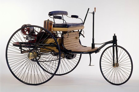
But it doesn’t end there either. Think about the different ways you can do things. Digging a trench with an old shovel, to watching a huge mechanical ditch digger at work. How about a sundial with a watch hooked on it? A light bulb and a candle, a horse and buggy and a new Mercedes. Again, just let your imagination run riot and go from there.
Now presentation of contrasting images is important too. This is where you should finally select the best two shots and get enlargements done. 14 inches by 11 inches is a good size and then get them mounted side by side using a double matte. With the cost of framing being so cheap in Thailand it is very easy to produce great wall art. All that is needed are your images and some original imagination.
 |
 |
 |


