My daughter continues to enjoy taking photographs (as well as the usual selfies). For her, with me rather handy, this means very personal one on one tuition. It also means that I can see immediately what has to be done to improve her skills.
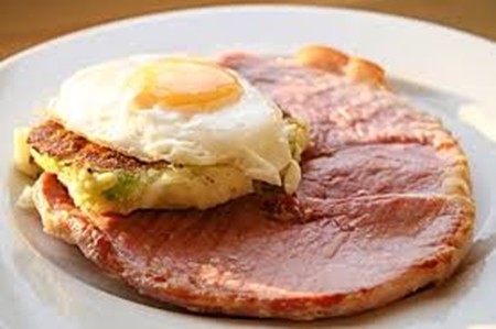
One catch-cry of mine has been “fill the frame” and finally she is starting to understand what is meant by this. The shots which precipitated this were a gammon steak and egg. The first shot showed the table, coffee cups and serviettes. Input by the photographer – nil. After admonishment to fill the frame, the second shot was much better, but there were still extraneous items along with the gammon plate. The third shot concentrated on the gammon plate and very little else, and daughter could see immediately that she had taken a photograph with some impact. It had a “hero” and that was the gammon steak and egg.
For impact, she finally got there. The “hero” was the gammon almost filling the frame, leaving nothing to distract from the reason for the shot.
The next item she was shown was that her hero deserved more than one shot. By moving the platter with the gammon, she could keep it filling the frame, but getting different views, and different light and shadows from the cafe window.
All good photographs follow the rules of good composition. The best known one of these is the Rule of Thirds, where you position the subject of the photo (that’s the hero) at the intersection of one third from the top or bottom of the viewfinder and one third in from the right or left side of the viewfinder. Look where the egg is positioned!
By just placing your subject off-center immediately drags your shot out of the “ordinary” basket. The technocrats called it the “Rule of Thirds”, but even just try putting the subjects off-center. While still on the Rule of Thirds, don’t have the horizon slap bang in the center of the picture either. Put it one third from the top or one third from the bottom. As a rough rule of thumb, if the sky is interesting put more of it in the picture, but if it is featureless blue or grey include less of it. Simple!
With some cameras where you can make a grid pattern on the viewing screen from the menu, such as on the DMC FZ series Lumix, it makes it even easier to position the subject. With the vertical lines, you will soon see if you have the subject vertical, and for horizontal subjects incorporating the horizon, you can also make sure it is level. This composition is something you can do in the camera as you take the shot. It does mean that you look critically through the viewfinder and position the subject correctly.
Now, that is not the only item you should think about with your photographs, though it is obviously a good start! The next item is cropping, where you get rid of non-important items from the final photo. These are items which do not add anything to the photograph you have in your mind’s eye. This can be extraneous details, such as a rubbish bin, which never does anything for landscapes. Or it may be that the hero is too small – because you didn’t walk several meters closer!
While post-production cropping to fill the frame can be done, it is better to do it in the camera beforehand. You can do this with post-production ‘edit suites’ or even a good Photoshop style program, where you actually do just the same as we used to with two L-shaped pieces of card, but with electronics. Call up your photo on the computer screen and with the cropping tools you can move them around until you feel you have the correct (most pleasing) crop. And fill the frame.
So this week the messages were simple. Remember to fill the frame to give your photos more impact, so walk in closer. Remember to position the subject at the intersection of thirds, and learn how to visualize the crop for dramatic effect and try to do this in the camera viewfinder. That will improve your shots immeasurably.
 |
 |
 |


